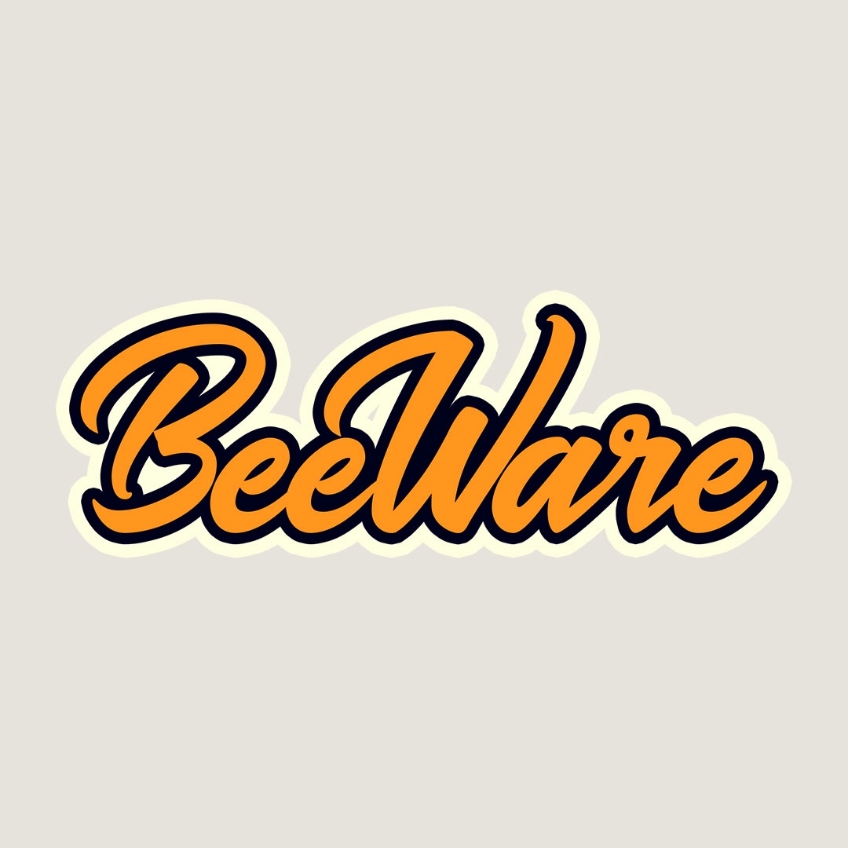
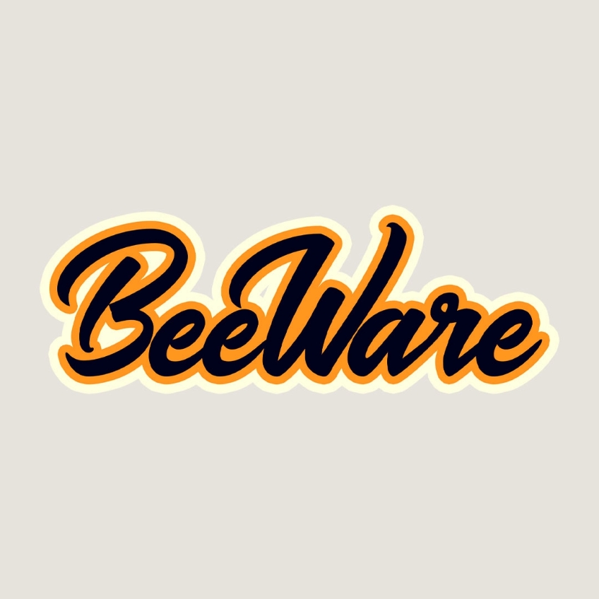
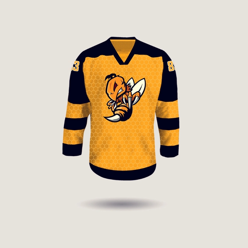
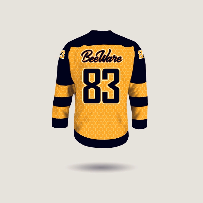
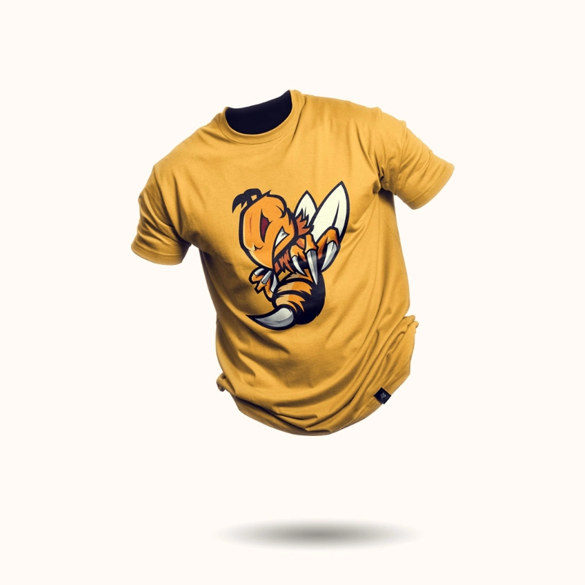
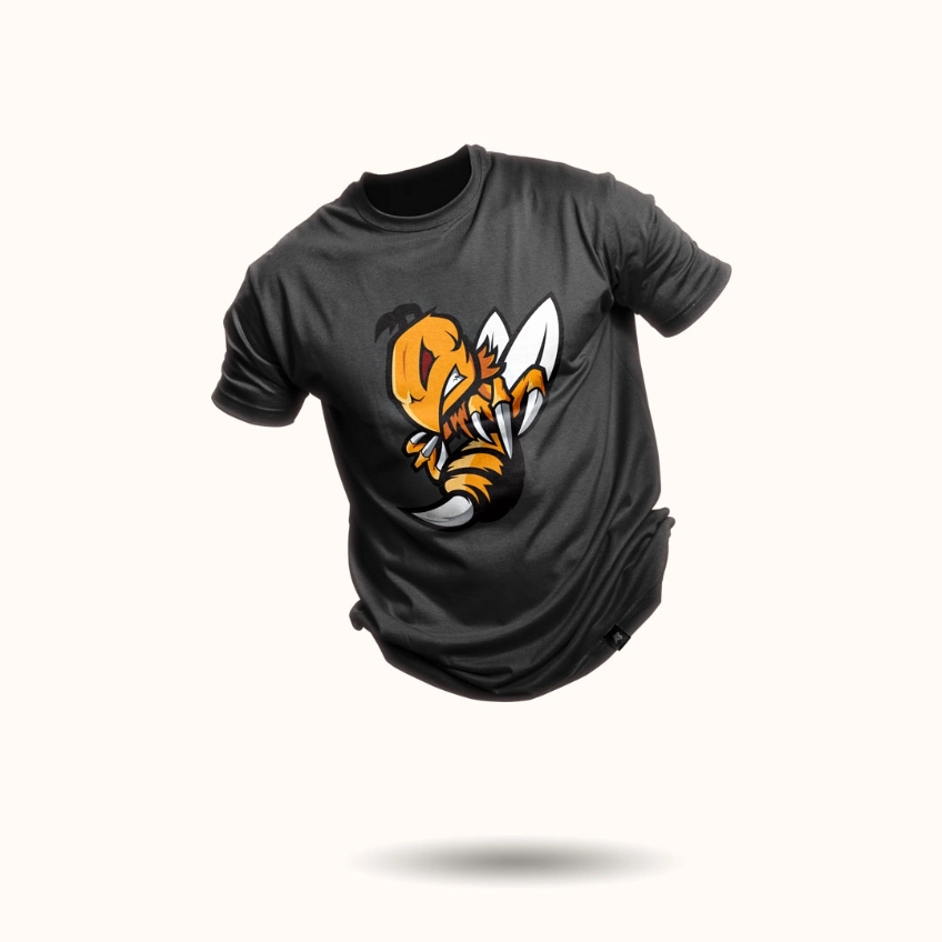
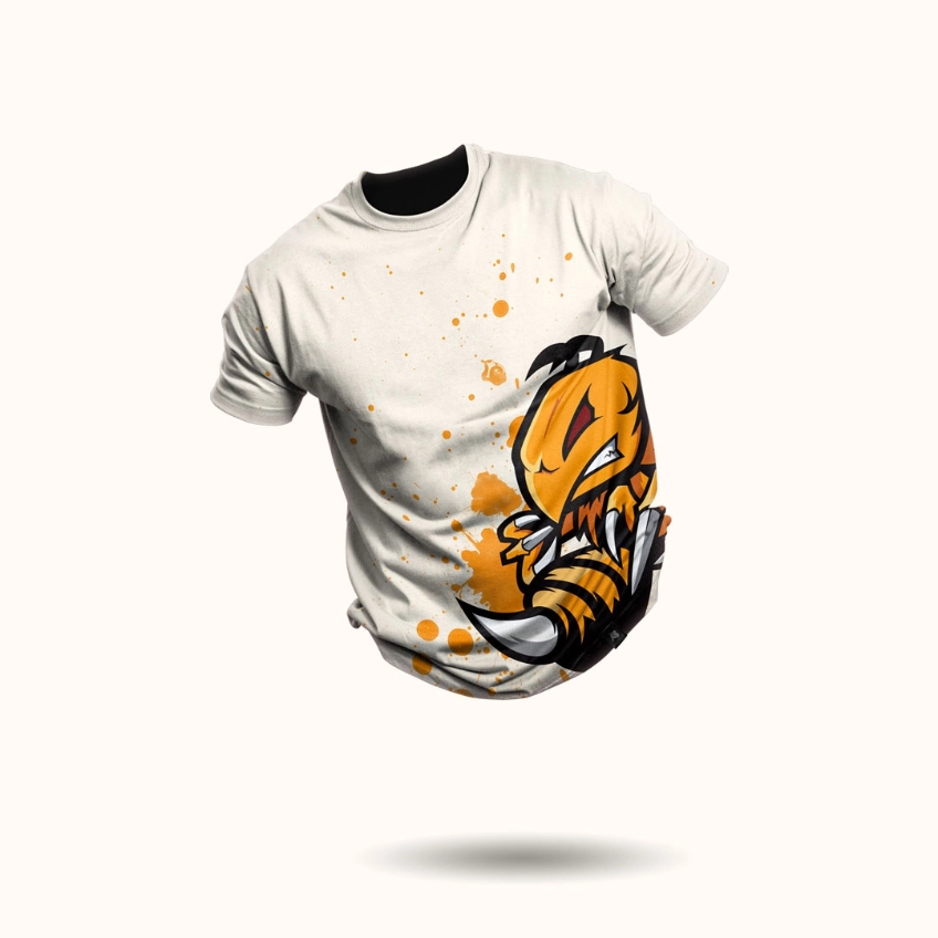
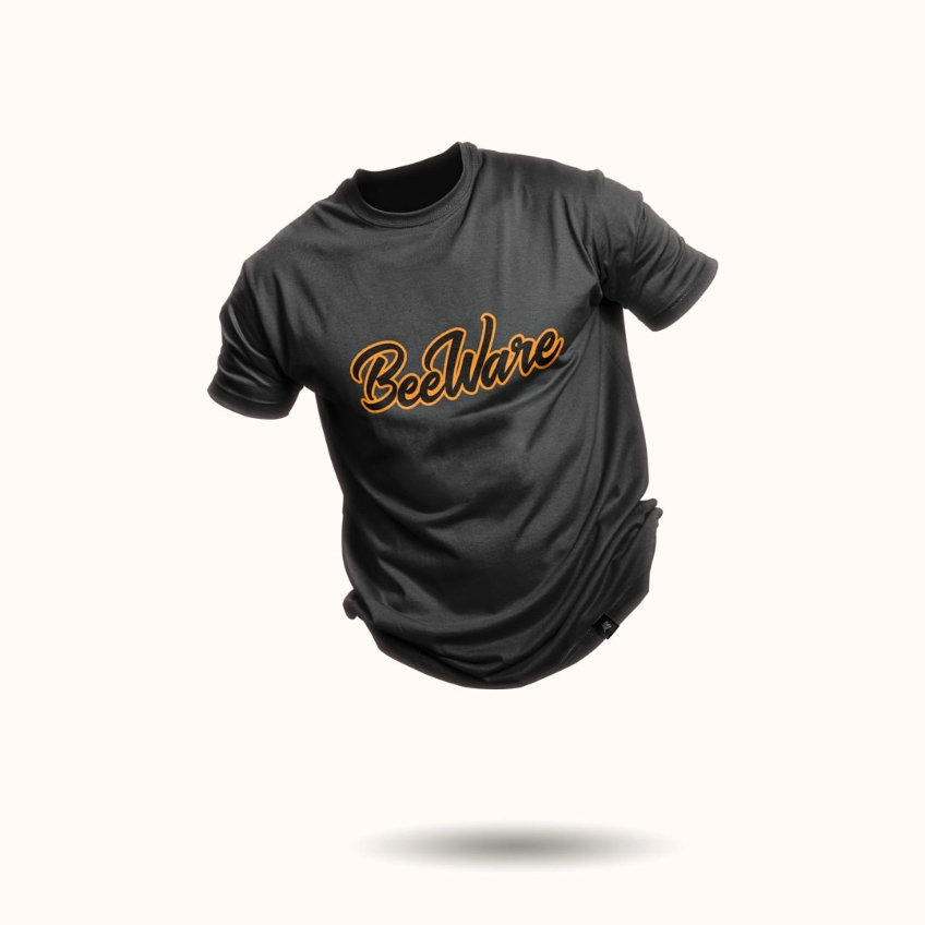
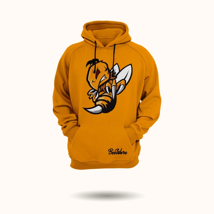
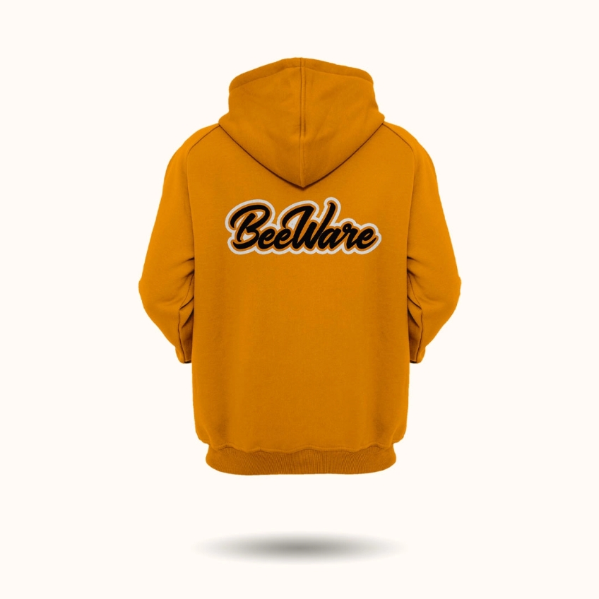
The BeeWare is an in-line hockey team for which we have created a name, a logo, a set of jerseys and their own merchandise. The very name of the BEEWARE team carries the message that BEES need to BEWARE.
The primary goal in the creating of the pictogram logo was to preserve the elements of realism with a minimum of distortion. The illustration itself is dominated by rectlinear shapes which are partially rounded, seeming aggressive and elegant at the same time.
When choosing the typography, we decided to use the bold script, which looks tasteful and in combination with the pictogram creates harmony. The color of the jerseys is composed of black and yellow, which represent the basic colors of the bee itself, the background is created by a hexagon graphic pattern.